PACKAGING


Branding and package design for a vintage-inspired, quality made tattoo equipment company. Packaging and visual language complement the brand idea that things really do get better as they age. Textures and colors are drawn from materials that also get better after time, such as old oak trees, leather, and bourbon barrels.
Fun fact 1: While borrowing the tattoo equipment to measure and test the packages against, I may or may not have taught myself how to tattoo. And then given my mom her first tattoo on my college apartment couch after graduation.
Fun fact 2: Every piece of packaging was hand-made including melting my own plastic and pouring molds for the ink containers. The only things I did not create from scratch were the tin and I did not blow my own glass. This time.
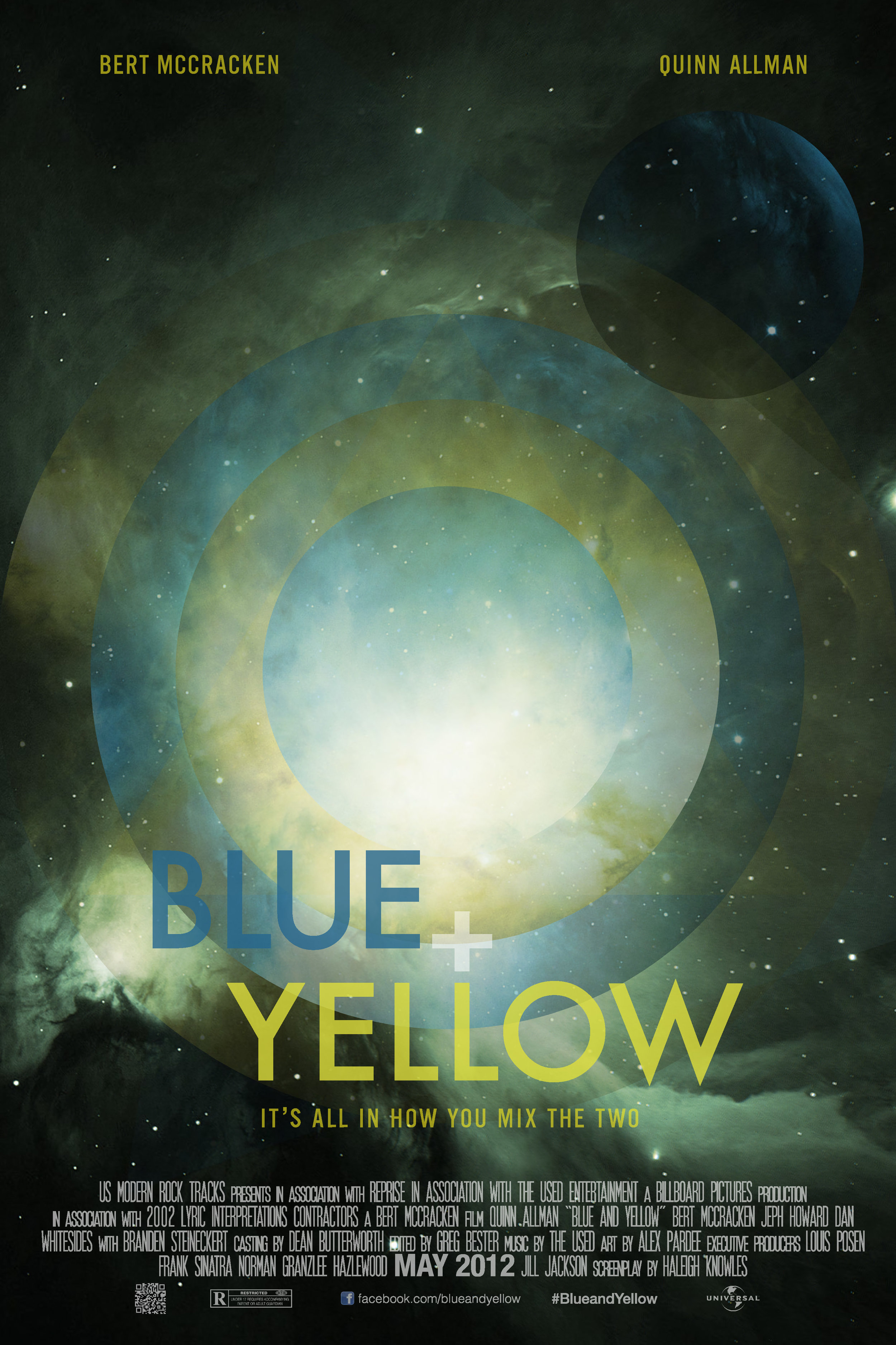
Movie poster designed for any subject other than a movie. Blue and Yellow is based around the strong meaning behind a song entitled Blue and Yellow. The logotype was designed to mimic the sub head “It’s all in how you mix the two” without actually mixing them and simply making green, as that is not the true meaning of the song. The image was created entirely in Photoshop.


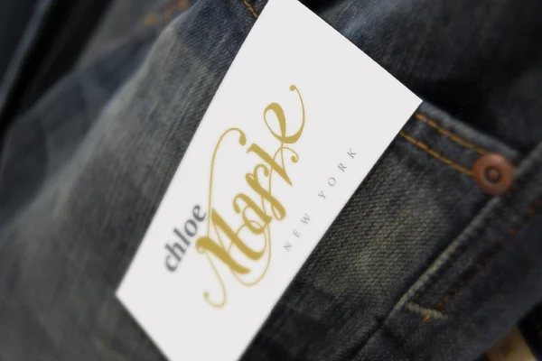


Chloe Marie, a fashion line for twenty to thirty year old fashion-forward, upscale classy women who love to travel, spend time outside at the beach and turn heads on a night out on the town. The hand drawn logo type of Marie is paired with a clean typeface and applied to several applications. The brand also includes a UX component. By becoming a loyalty member with Chloe Marie and giving your information to receive catalogs and other promotions, you are treated like more than a customer. The designed deliverable is a direct mailer a loyalty member would receive during their birthday week with a PrePaid Visa with just enough for Chloe Marie to buy you your first drink of your birthday.
BACK